Designing golf tournament flyers is tough. Graphic designers are often very expensive to hire, and golf managers don’t usually have extra time to spend learning the best design practices.
We’ve put together this guide for operators who want to look into making some designs themselves, along with a free collection of golf tournament flyer templates for you to download and use at your own course.
How should I design my tournament flyers?
There are some fundamental design practices to keep in mind when creating golf tournament flyers. For the sake of this blog post, we can’t dive into the micro details that a professional designer would, but we’ll go over some main points that you’ll need in order to get started.
Plan it out before you start creating
Any good golf marketing strategy starts with planning. For your golf tournament flyers, begin by thinking about what the main goal is: for golf tournaments it usually is to get people to attend your event. With this in mind, you can start putting together what you’ll need on the flyer and what angle you can take to pique golfer’s interests.
You’ll also need to figure out a timeline. Distributing these flyers the night before your event won’t do too much, but you also don’t want to put them out so far in advance that people aren’t ready to make their plans. A good rule of thumb would be to slowly start advertising your tournament 3-4 weeks prior, and ramp up visibility as the date approaches.
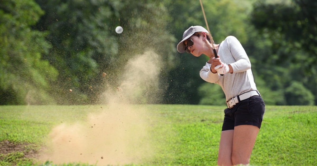
Use eye-catching imagery
You’ll probably want to include some imagery from your golf course. The exact type of photo is up to you, but scenic, overhead shots would probably work best to attract some eyes to your promotional material.
These images will also give people an idea of what your poster is about without even needing to read any of the copy. This is super important if you want golfers to actually pay attention to your tournament flyers and not just ignore them as they go about their day.
Direct the attention towards a focal point
The focal point of your flyer should be the information that you think is most important to communicate first. If you’re hosting a charity event, you may want the section about the charity to be highlighted. If not, you can put the word “tournament” at the forefront, or the fees if you’ve got a good deal. There are a few methods for creating a focal point, including:
- Large, bold lettering
- Leaving some negative space around what you’d like to highlight
- Using a contrasting color
Select the right colors
The colors that you select will have a serious impact on how many eyes your flyer attracts and what kinds of emotions people will feel. Warm colors like red and orange can incite feelings of excitement, warmth and energy. Cool colors like blue and green can be more calming, associated with nature, and conservative.
Decide what kind of feelings you want people to feel that will make them more likely to book their spot. Do you want to get them excited? Or show off the conservative feel of a private tournament? Either way, make sure that the colors on your poster work well together.
Pick a font that shows the feeling of your tournament
Like colours, fonts can also emit a certain tone and incite different feelings. The typography you choose will convey the mood or atmosphere of your tournament, so make sure that you align the font with how you want people to feel. One of the easiest examples to think of is a Halloween font. “Spooky” letters do an amazing job of getting the feel of the holiday across to the reader, but they wouldn’t work for other occasions, like a corporate event.
Still not sure which font to pick? Take a look at these examples and see which font seems to convey the same message that you’d like to with your promotional material.
Use lines to split up your content
Although the amount of copy should be kept to a minimum on your flyer so that people will actually read all of the information, sometimes things can get too crowded. An easy way to break up large pieces of text is to use lines as dividers.
Take a look at the examples above, without the lines the information may seem packed and disorganized. However, the separations make it much easier to move from one piece of information to the other and make the entire flyer much more aesthetically pleasing.
Spruce up your flyer with some shapes
Placing text over an image of your golf course would be boring and it would make your flyer very hard to read. Shapes are a great way to add some interest to your promotional piece, while also providing an even background for your copy.
The shapes that you choose will have an effect on the tone of your golf tournament flyers. Round, bubbly shapes may come off as more fun and light-hearted, while rectangles may give off a more elegant and serious look. Once again, the design choices you make will come down to what kind of operation you run.
Only include the important information
The content of your golf tournament flyer is key. Too much info will be hard to follow and will lead to heads turning away, while too little info may leave readers confused as to what they’re seeing. Think of what is essential for people to know up front, and what can be left for when people visit your website or call up your pro shop.
Here are some examples of key information that you should include on your flyers:
- The name of your course
- The location of your course
- What date the tournament will be held on
- What the attendance fees are
- On-site amenities or events
- Contact information
Of course, every flyer will be different, but sticking to those guidelines will help you make sure that you’re providing just the right amount of information.
How can I get people to make a reservation after they see my flyer?
You’ve got a beautifully designed flyer that’s getting a bunch of attention, now it’s time to make sure those people actually book their spots. On a printed flyer, a call to action could include telling people how they can make their reservation by providing your phone number and website address.
Make sure that the url you use is not long or complicated. For example, use something like “www.golfcourse.com” and not “www.golfcourse.com/tournaments/july-2019-charity-golf-course-tournament.”
You might also want to incentivize people to act quickly by using a tagline like “Spots are very limited” or by offering an early bird special to those who book before a certain date. This will ensure that people will actually act on your messaging and not just put off booking their spot until the last minute.
How should I distribute my tournament flyers?
Think of locations around your golf course that customers might frequent. Grocery stores, restaurants, and other small businesses may be some good spots for flyers. You also need to make them visible at your golf course.
Online flyers should be posted to your social platforms, but use them sparingly. People are on social media to be entertained, not to be bombarded with pure sales messages. There is a small space for flyers on this channel but they should be mixed in with other posts.
Digital flyers should also have a link in the caption that brings users to a page on your website where they can easily make their reservation. The process of becoming aware of your tournament to attending should be as seamless as possible, make it easy for golfers to move from one step to the next to avoid them abandoning partway through.
Which software should I use to make my golf tournament flyers?
There are some industry leaders in photo-editing software, like Photoshop, that provide a high-quality product. You can get a free trial of Photoshop, but you will be charged a monthly fee once the trial ends. These applications can give creators some amazing results, but learning to use them properly can take a long time.
An easier (and free!) alternative is Canva, a simpler graphic design tool that anyone can quickly learn to use. The real challenge still lies in actually coming up with a design for your golf tournament flyers, so if you need some help you can check out our free templates.
What should I take away from this guide?
Whether you choose to make the flyers yourself, use pre-made templates, or have a professional designer make them, you should keep these guidelines in mind:
- Plan out your flyer design and strategy before you start designing
- Use eye-catching imagery
- Create a focal point around the most important bits of information
- Select colors and fonts that reflect the atmosphere of your tournament
- Use lines and shapes to structure your content
- Include all relevant information, but keep it concise
- Use a CTA to drive golfers to make a reservation
- Distribute your flyers effectively
- Use a design software that is right for you
News you care about. Tips you can use.
Everything your business needs to grow, delivered straight to your inbox.