Your website’s design is the first impression many customers have of your business.
Even small design updates, especially those that reduce friction or improve site navigation, can lead to meaningful increases in sales. When it’s easier for customers to browse, buy and track their rewards, they’re more likely to complete purchases and return for more.
Lightspeed’s latest Instant Site updates are designed to make these impactful tweaks accessible and easy to implement.
In this blog, we’ll go over five quick site design tweaks you can make with Lightspeed eCom:
- Pre-fill customer info for a smoother checkout
- Vary promotion section layouts to tell a visual story
- Add product filters to your catalog page
- Showcase all your locations in one clean section
- Give shoppers more control over loyalty tracking
Do online retail better
Streamline inventory, payments, site design and more with Lightspeed's omnichannel platform. From intuitive POS, eCom and stock management features to powerful reporting, Lightspeed gives you the tools you need to grow.
1. Pre-fill customer info for a smoother checkout
Long checkout forms are one of the top reasons online shoppers abandon their carts. Tweaking your checkout design to remember customer details removes a key piece of friction.
Cart abandonment is a huge problem for ecommerce, with average rates hovering around 70%. A significant portion of this abandonment is attributed to lengthy or complicated checkout processes.
Even a few extra seconds can mean the difference between a sale and a lost customer.
For example, let’s imagine Sarah, a busy mom, is trying to quickly reorder her favorite organic fertilizer from your online store. In the past, she’d abandoned her cart halfway through, frustrated by having to re-enter her address and payment details while juggling her kids. This time, she’s delighted to see her information pre-filled, making the entire process take seconds.
With Lightspeed eCom, returning shoppers can now skip re-entering details, streamlining the buying experience. This reduces the likelihood of a shopper not completing the transaction, which can lead to higher conversions and a smoother shopping experience.
This feature is ideal for stores with loyal, repeat customers, such as those selling gardening supplies, pet food, beauty supplies or consumables.
2. Vary promotion section layouts to tell a visual story
Online shoppers decide whether to engage with a promotion in seconds. Potential customers spend an average of just 5.59 seconds looking at a website’s written content—and even less if it doesn’t visually stand out. Rotating your site’s visual content and layouts helps keep promotions from blending into the background, while static, unchanging website design can lead to shopper fatigue.
However, you also want to avoid overwhelming visitors with a cluttered page. Varying website section layouts allows you to showcase different offers in an exciting way without making your pages unnecessarily long or visually overwhelming.
With five new promotion slider layouts for Lightspeed eCom, you can enhance your site with engaging design, expanding your brand storytelling with less effort. These sliders help you highlight promotions, special offers and key content.
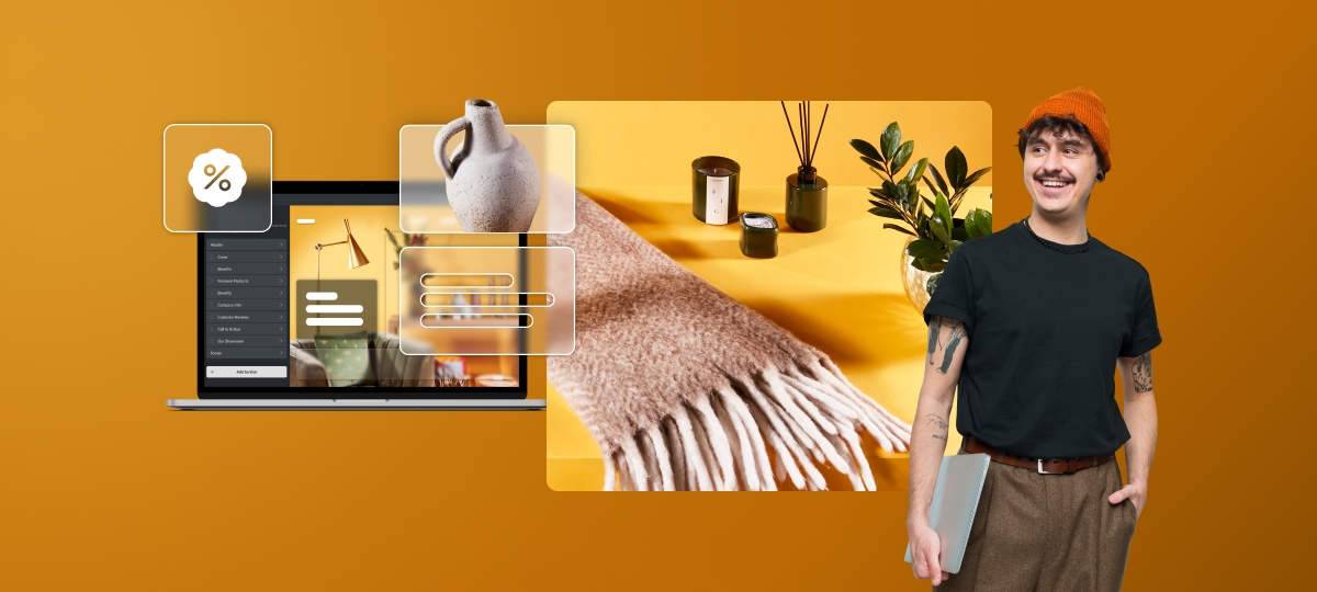
Make the most of your new promotion sliders by keeping your message concise—aim for under eight words—with one message per slider. Use high quality visuals and switch up their content often to keep them engaging for returning shoppers.
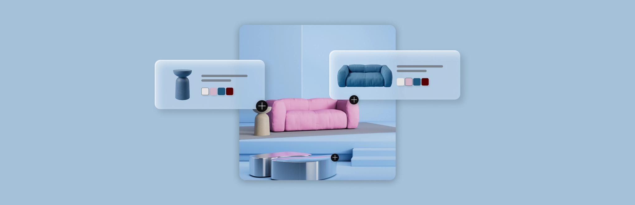
3. Add product filters to your catalog page
When customers can’t find what they’re looking for quickly, they leave. Poor site navigation is one of the top reasons for cart abandonment, especially for stores with large or varied product catalogs.
Adding filters directly to the catalog page reduces friction in the shopping journey, making it easier for shoppers to narrow down options by size, category, brand or price. This small design tweak can make a big difference in boosting conversions and reducing bounce rates.
We’ve updated Lightspeed eCom to enable product filters directly on the catalog page, not just on category pages. This enhancement improves navigation for customers browsing large inventories, especially for stores with large catalogs, where filtering plays a crucial role in the shopping experience.
4. Showcase all your locations in one organized section
When shoppers can’t easily find the right store, they get frustrated and bounce. Retail chains, appointment-based businesses and stores offering in-person pickup all benefit from clarity—especially when customers are trying to figure out which location suits their needs best.
Whether you have multiple locations in the same city, varying inventory between stores or offer services like local pickup or appointments, making your locations easy to find is crucial. It might not seem like the most exciting part of designing a site, but having that information obvious and easy to find is crucial.
With Lightspeed eCom’s new multi-location site section, you can easily showcase multiple brick and mortar locations in one streamlined website block. This helps you improve the customer experience and drive more conversions, because shoppers can choose the nearest and most convenient location to visit or order from.
5. Give shoppers more visibility on loyalty
Loyalty programs are most effective when customers can see their progress. With omnichannel shopping now the norm, shoppers expect their in-store loyalty points to be visible online.
Adding loyalty visibility to their online account is a UX design win—it’s not a flashy visual update, but it can have a huge impact on engagement and retention. By giving customers real-time visibility into their rewards, you make loyalty feel tangible and worthwhile.
That’s why Lightspeed eCom now allows customers to track and manage their loyalty points earned both offline and online within their online store account, making engaging, retaining and rewarding shoppers across all sales channels easier.
Once your loyalty program is truly omnichannel, here are 3 tips for promoting the benefits on your site:
- Clearly display loyalty program information: make it easy for customers to find details about your program, including how to earn points and what rewards are available, as well as the fact that they can find their points tracking in their account.
- Personalize your loyalty messages: use targeted messaging to remind customers of their points balance and suggest relevant rewards.
- Offer exclusive loyalty points for products you want to move: bump up the loyalty rewards for specific products to give customers a nudge to buy—something you can also do with Lightspeed eCom.
Start with a change and watch the results
Improving your ecommerce user experience doesn’t require a full rebrand, just smart, strategic tweaks.
By implementing these five simple site design updates, you can help improve your online store’s usability and create a more enjoyable shopping experience for your customers.
Already have Lightspeed eCom (E-Series)? Click here to log in and get started with these updates.
Interested in what Lightspeed could do for you? Click here and someone will reach out.

News you care about. Tips you can use.
Everything your business needs to grow, delivered straight to your inbox.